
Library Website Redesign
Optimizing core tasks

ABOUT
The University’s digital front door to databases, services, and connecting with library staff for more specific research projects.
Responsibilities
Lead user research and user testing
Coordinated content audit and card sorting
PROCESS
OBSERVE 👀
What do you focus on for a redesign? CORE TASKS!
I wanted to get as much qualitative and quantitative data as possible. Based on analytics I knew the databases page was the most popular service, but I wanted to learn what ELSE do users mostly do on the site and where do users struggle?

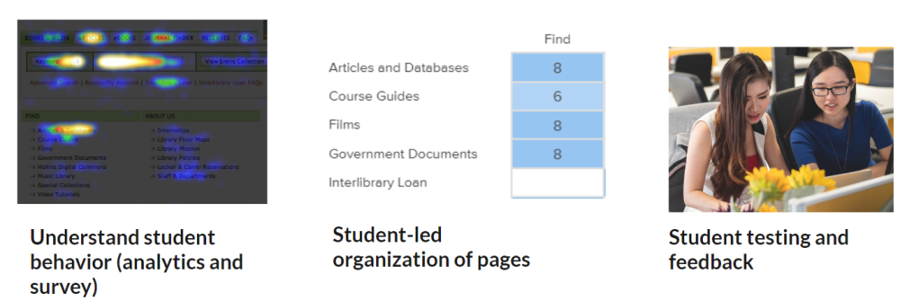
This is a heatmap from that shows where library users click on the homepage. This tool helps ME DISCOVER active parts of the website.

Survey trends

Survey trends cont.
Survey results (61 responses from students, our largest user group)
Interviews from front line student library workers
Heat map activity
Google Analytics
I collected and analyzed
ADDRESSING SURVEY TRENDS
“GOOD ORGANIZATION” - 2 specific methods for this general request
Two methods came to mind when I saw users’ request for “good organization.”
Content Audit
Card sorting
I chose content audit to address the issue of clutter on a large scale (e.g. looking at the entire site). Other methods would be too narrow in scope to address a request of better organization.
I chose cardsorting because it allowed students to place pages to match their expectations for organization.
Cardsorting also helped me break away from my notions about taxonomy/organization. Card sorting pairs especially well with content audits as an audit provides an updated list of pages to use in the card sort. This method collects feedback from users and thereby acts as a counterbalance to the library staff-dominated input of content audits.
CONTENT AUDITS - a broad, comprehensive approach
I knew content audits were valuable, but tedious and time-intensive because they involved looking at EVERY page on a website. They are tedious, the “watching paint dry” of usability methods. I knew I could not do this by myself and I wanted other staff to participate and be motivated.
How would I get buy-in from other staff to assist?!
I assigned pages to staff that directly connected to their jobs (e.g. the Outreach/Marketing librarian looked at the Library News page statistics). I also shared analytics to temper unrealistic expectations about the importance of each page. I knew that bringing in analytics data strengthened a content audit because it added user behavior to the decision-making process of auditing. We had “conversations” in Google Drive about each page, sharing recommendations of either C (combining with another page), E (Eliminating), or R (replacing).
RESULTS- combined 2 pages, corrected outdated language about login procedures, moved links to more appropriate pages, discovered a few pages that were linked from multiple menu categories

CARDSORTING - do our categories and organization make sense?
I was also concerned we had too many categories. We had categories for “Find,” “Borrow,” “Services,” “News,” “Contact Us,” and “About Us”. Many of these categories overlap and could create confusion for a user. Interlibrary Loan, for instance, is a service, but is also a form of borrowing.
I used Optimal Sort from Optimal Workshop for a “closed” card sort with the categories, Find, Services, About Us, and Help.
To check the appropriateness of the categories I picked I included the question
“Do you think there should be a different category from the ones listed (Find, Services, About Us, Help)? If so, what would you name this category?”
Overall, participants approved of the proposed categories, deeming them comprehensive and easy to understand. After sharing the results with library staff for discussion, I renamed the categories and reassigned several web pages to different categories, based on the users’ responses.
Usability Testing - tasks that reflect survey trends and allow me to explore
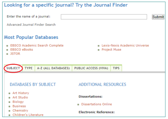
Testing with 10 users revealed most did not use the SUBJECT tab to find subject specific databases.
Sequencing of methods is important. How would I design a usability test if I did not know users’ key tasks or difficulties they have? Without that knowledge, a usability test might include tasks that interest me, but do little to explore a user’s needs.
The survey results showed that users wanted an easier way to access databases, a less cluttered homepage, and a more readable layout or design. I was intentional in designing tasks that would hopefully address and tease out difficulties users had with the website.
Pain points
Databases: Students were confused when interacting with the databases page and most left, finding subject specific databases from a different set of pages, (i.e. our course guides, which contain subject-specific databases).

A third of users were unable to find a librarian by discipline or subject specialty using the staff listing.
Subject specific Librarians: When asked, “Which librarian would you contact for help with an economics assignment?”
Students did not associate specific disciplines such as economics with larger categories like Social Sciences.
PROTOTYPE PREVIEW
At the conclusion of the usability test I showed participants an alternative databases page.
Student responses to Prototype
“I like the format and being able to search for a database by title. “
“I like the limiters, specifically for database type because I like being able to see primary sources. “
“This database page was more direct/obvious”
I like the aesthetic. It looks more current.”
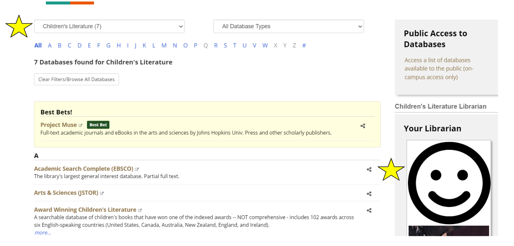
The prototype gives a user an option to sort databases by subject and also dynamically displays the subject specific librarian.
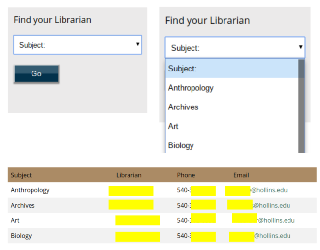
ADDRESSING Librarian findability
DESIGN RESPONSE SOLUTION
I placed “Find your Librarian” dropdown menus on the “Staff and Departments” page and the “Ask a Librarian” page as well as a table with librarians by subject.
I wanted to give users multiple pathways to finding a librarian by subject. Adding the new databases page and these two other pages meant users had three pathways.
Databases page
Staff and Departments (table and dropdown)
Ask a Librarian (dropdown)

Results of 2nd round of usability tests
I conducted another round of usability testing with the same tasks and our new databases page and enhancements .
BONUS - 🏆The Low effort/high impact award goes to….
Both the survey and interviews with front line student library workers showed users had difficulty finding where to log into their account. I decided to place the My Account feature in the top right because it is a standard design convention and meets users’ mental models of account management location. Two semesters of data with the new design showed an increase of 38%.

What I learned + what I would do differently
I have a strong template now for redesigning sites with a staged and structured approach.
Librarian demands (not specific to this project) meant this project took 2 full semesters and one summer to complete. If I were to do it again, I would restructure the timeline and recruit other staff to assist so that the timeline was much shorter.


